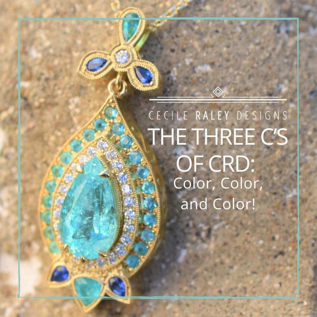
The Third C - Using Color in Design
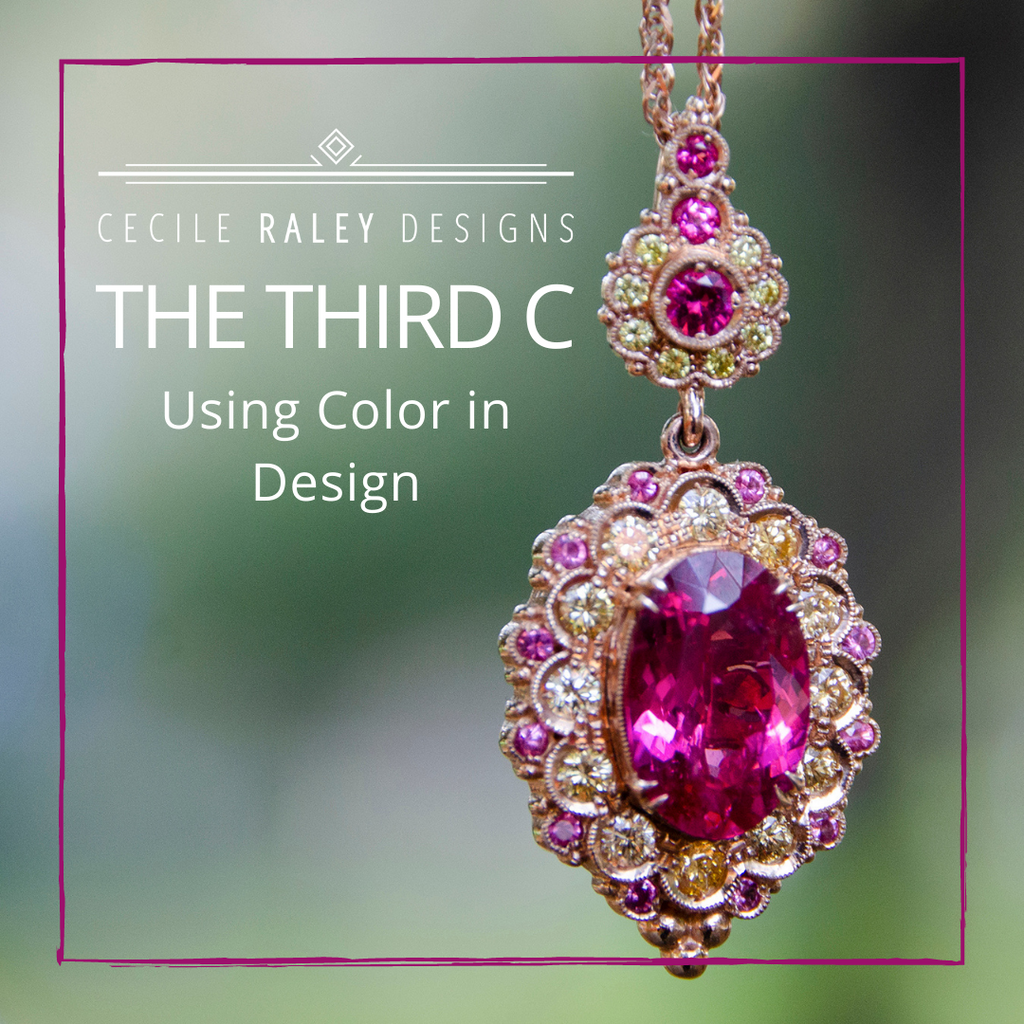
Finally, let’s get back to talking about color. In this final entry in our discussion about color and gemstones, I want to focus on how I like to use color in design.
First, a little background. When I first started making jewelry, I was using beads. I initially strung up glass beads and Swarovski crystals with base metal spacers but I very quickly graduated up to gemstone beads and wire wrapping. Since natural gemstone beads don’t come in just any pantone color, I realized that combining colors for a pleasing result could be challenging.
What helped me was mixing color “themes” either on tissue paper or a white plate. I pulled some beads off the strands, mixing until I had the right colors, the right proportions of those colors, and the right metal for spacers. (I used to have a LOT of beads).
I still work this way. As we carry a lot of melee gems, I can lay them out together until I have a combination I like, and I can use the little sticky boxes from Stuller to make gems face right side up. But given that I’ve done this for over a decade, I can offer some shortcuts:
- Start with the gem you really want to use. This does not have to be the focal gem, it might be a single accent stone or a few melee. In many of my designs, the center stone is the complement and the side stones the attraction. This makes particular sense when the bigger stones are too expensive.

Mexican Fire Opal and Ruby Ring 
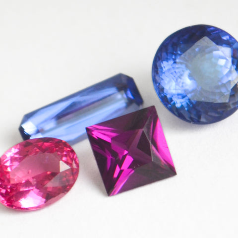
Malaya Garnet and Paraiba Tourmaline Ring - Once you have your main focus, you work on complementing it. I personally like working tone in tone, meaning ombres or gems of the same variety because they always seem like they belong together. But availability doesn’t always allow for that, so another way to go is contrastive: pinks and greens, purples and blues, peach and teal, pink and orange, yellow and purple. Always keeping in mind which color should be dominant.


- Metal is a color. Here’s a link to the blog I did on metals. Rose gold blends the most with other colors, yellow gold is a totally independent color, white gold cools the temperature but can look like too much metal if the side stone gems are not diamonds.

Our Camellia Pendant Featuring Zircon and Mint Garnet
- Don’t forget that gemstones have other properties besides color, and they matter. Gems can be transparent (aquamarine) or satiny (emerald), and it’s often easier to combine just transparent and just satiny stones, unless again you are trying to complement. Gems also range from very brilliant (diamond) to almost not brilliant at all (Paraiba Tourmaline). Combining these will be more contrastive, less complementary.

Our Cleo Ring, Featuring Paraiba Tourmaline and Diamond 
Paraiba Tourmaline and Hauyne Ring - Natural gemstones also have hues, bi-color effects, color change, di- and tri-chroism, all of which have to be considered in the overall color scheme. For example, purple-pink sapphires often have a bi-color effect that is due to zoning in the gem. Sphene, kornerupine and unheated tanzanite often exhibit some degree of di or tri-chroism, and some garnet, sapphire and alexandrite exhibit color change. For gems like this, it’s best to complement the colors that are already there, as opposed to trying to introduce an entirely new color.
Purple Garnet, Mahenge Spinel, Tanzanite, and Cobalt Spinel 
Our Edwardian Ring Featuring Purple Garnet and Color Change Garnet 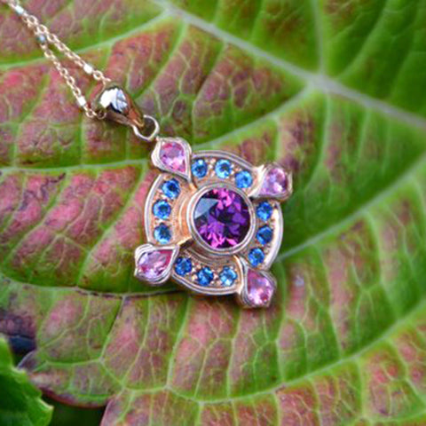
Our Tudor Pendant, Featuring Purple Garnet, Hauyne and Mahenge Spinel 
Elizabeth Ring Featuring Sphene
One final tip. When I first learned how to use a real camera, back in 1982, my dad’s simple advice was this: if you don’t like the way it looks through the camera, don’t take the picture. In other words, trust what you see, not what you want to see. If you don’t like a combo, don’t try to like it, it won’t work. I often used to make pieces where after an initial ever so brilliant idea, my reaction to the actual combination was “meh.” Most of those pieces had to be sold at discount. That’s not a mistake you need to repeat. ☺️
Continue reading